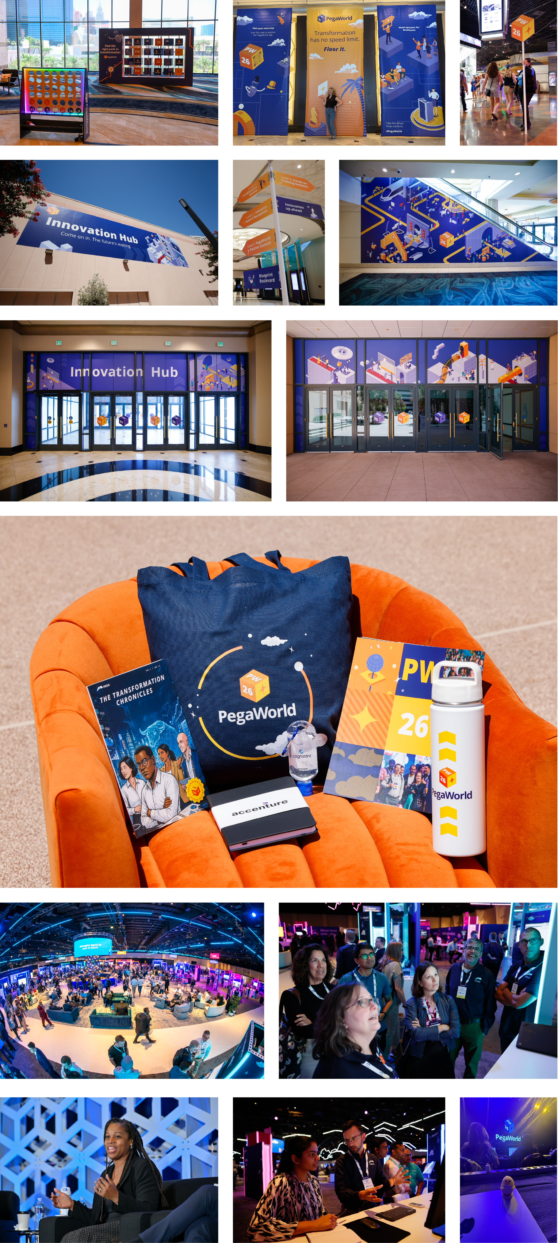
PegaWorld 2026
EVENT BRANDING // ART DIRECTION // MARKETING STRATEGY
PegaWorld is the flagship event for Pegasystems, and for me, it was a particularly meaningful project. I had been a designer at Pega since my internship in January 2021, so I knew firsthand just how much work, collaboration, and attention to detail goes into bringing this event to life.
For every creative at Pega, PegaWorld is something of a rite of passage. Everyone touches it in some capacity each year, but there is always one lead designer responsible for bringing the creative vision together. After supporting the lead designer for several years, 2026 was the first year I took the lead and ran the project myself.
As the lead designer, I was responsible for developing the visual brand for PegaWorld 2026 and ensuring that identity was applied across the whole event.
I collaborated closely with our strategy and copy team to make sure the visual and messaging worked together and communicated clearly to our audience.

We started with a complex and thorough creative brief. Stakeholders wanted PegaWorld to feel like an evolution of the visual identity used in previous years, while still maintaining the brand equity we had built over time.
That balance was particularly important. PegaWorld has developed its own recognizable visual language, and completely abandoning that equity would have made the event feel disconnected from its history. At the same time, 2026 needed to feel like a new chapter.
The message for PegaWorld 2026 was to represent a unique inflection point in where technology is headed. Our target audience. primarily C-suite executives and senior IT leaders, were feeling overwhelmed by the pace of AI transformation. They were struggling to justify technology investments and looking to separe industry hype from actionable strategies.
We didn't want PegaWorld to seem like just another conference. We wanted to position it as a strategic roadmap through the complexity of AI transformation.
Previous PegaWorld events had embraced a more colorful, playful, and sometimes whimsical visual approach. For 2026, I wanted to pull back on some of that visual noise and create something more intentional, and confident.
The result was an identity that still allowed for moments of personality and fun, but used them more deliberately to support the larger story.
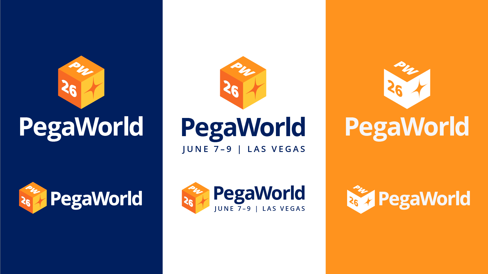
A roadmap pattern became one of the signature visual elements, representing direction, progress, and navigating an increasingly complex technological landscape. I paired this with chevrons derived from Pega's iconic cube logo, and a streamlined color palette, creating a visual system that felt connected to the broader Pega brand while still giving PegaWorld an identity of its own.
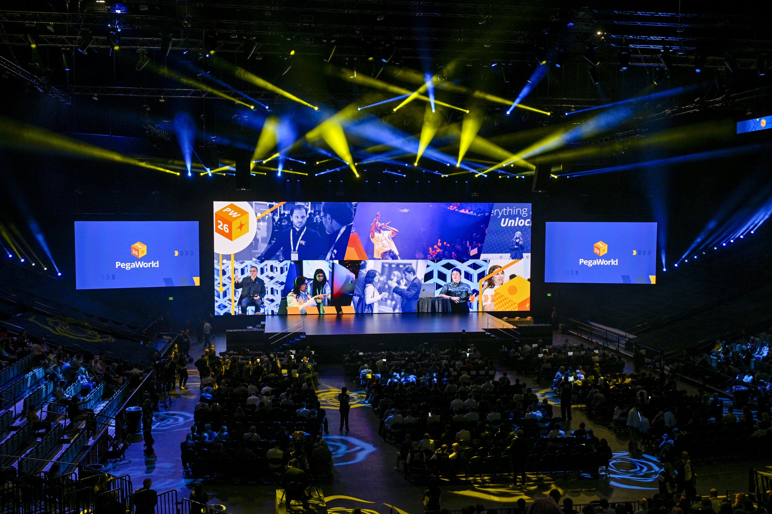
One of the most rewarding parts of the project was finally experiencing PegaWorld in person.
After spending months designing individual pieces of the experience, it was incredibly fulfilling to see everything come together in the real world: the signage, presentations, website, marketing materials, environmental graphics, and all of the details that my team and I had worked on throughout the year.
Seeing the visual system operate as a cohesive experience rather than as individual design files was a completely different perspective on the work.
More than anything, leading PegaWorld 2026 pushed me to grow as a designer. It challenged me to think beyond individual deliverables and consider how an entire brand experience works together across audiences, mediums, teams, and months of development.